Motion in digital experiences is often misunderstood.
For a long time, animation was treated as decoration—something added at the end to make interfaces feel more polished or visually exciting. But today, motion is no longer optional flair. It is a core part of the user experience stack.
Good motion design doesn’t just make products look better.
It makes them clearer, more intuitive, and more human.
More Than Eye Candy
In the early days of the web, motion existed to add “pop” or delight. Today, it plays a far more important role: helping users understand what’s happening on screen.
Motion explains relationships, reinforces hierarchy, and reduces friction. When used intentionally, it replaces heavy instructions with visual clarity.
The best motion design is often invisible—it works because it feels natural.
1. Guiding Attention
Human vision is biologically tuned to detect movement. Our eyes instinctively follow it.
In UX design, motion becomes a tool for directing focus without overwhelming the user. A subtle bounce on a notification icon, a soft pulse on a call-to-action, or a slide-in message immediately tells the user where to look—no explanation required.
Instead of shouting for attention, motion guides it.
2. Reducing Cognitive Load
Instant changes in an interface can feel abrupt and confusing. Motion bridges the gap between states.
When a menu slides in rather than appearing suddenly, users understand its spatial origin. When a card expands smoothly, users intuitively know how to collapse it. These transitions help the brain build a mental model of the interface.
Motion turns state changes into a story the user can follow.
3. Providing Feedback
In the physical world, every action produces a response. Digital interfaces should behave the same way.
Micro-interactions—such as a button pressing down, a toggle sliding, or a form field responding—confirm that the system has registered the user’s action. This feedback loop reduces uncertainty and builds trust.
Without feedback, users hesitate. With it, they move forward confidently.
The Emotional Layer
Beyond usability, motion defines personality.
The way an element moves communicates tone:
- Fast, sharp motion feels energetic and bold
- Smooth, slow motion feels calm and premium
- Elastic or playful motion feels friendly and expressive
This is emotional design at work. Motion becomes the voice of the brand—often speaking louder than color or typography.
When done well, motion turns a functional product into a memorable experience.
Motion as a Strategic Design Tool
Motion should never exist for its own sake.
Every animation should answer at least one question:
- Does this help the user understand something?
- Does it reduce friction or confusion?
- Does it reinforce brand personality?
When motion is intentional, it becomes a strategic layer of design—not decoration.
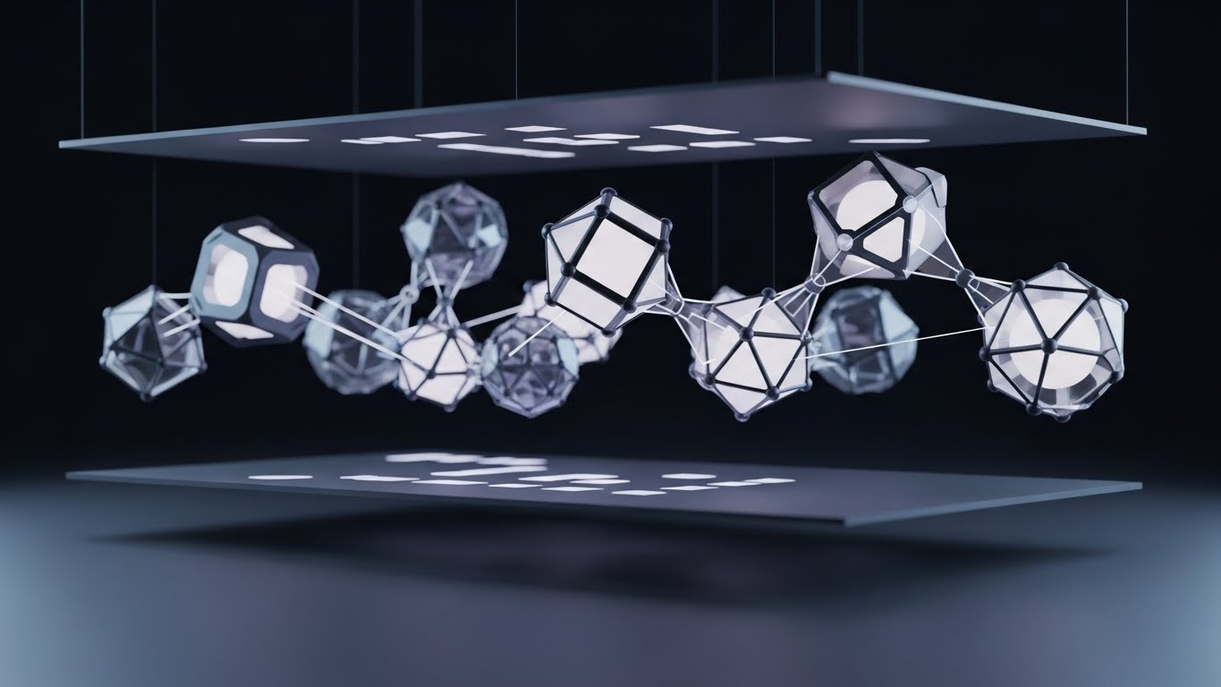
Abstract 3D Motion and Experiential Design
As interfaces evolve, abstract and 3D motion is increasingly used to communicate mood, depth, and emotion.
These forms may not always convey literal information, but they:
- Set emotional context
- Create immersion
- Signal innovation and craft
In brand experiences, abstract 3D motion often acts as the emotional entry point—drawing users in before a single word is read.
Conclusion
Motion design sits at the intersection of psychology, usability, and storytelling.
When applied with intention, it guides attention, reduces cognitive load, provides reassurance, and builds emotional connection. It transforms interfaces from static screens into responsive systems that feel alive.
Great motion design doesn’t demand attention.
It earns trust—and makes interaction feel natural.